Picture a homeowner in Wayne with a leaking water heater, trying to tap your phone number with a wet thumb. Good mobile UX design decides whether that person reaches you or hits the back button and calls the next name on the list. Most of it comes down to small, fixable details on a small screen.
If you still need convincing that phones matter, start with why mobile-first web design is no longer optional. This post skips that debate and goes straight to the phone-screen details that quietly cost you calls: tap targets, forms, text size, menus and pop-ups, plus a 15-minute test for your own site.
Mobile UX Starts With Thumbs, Not Cursors
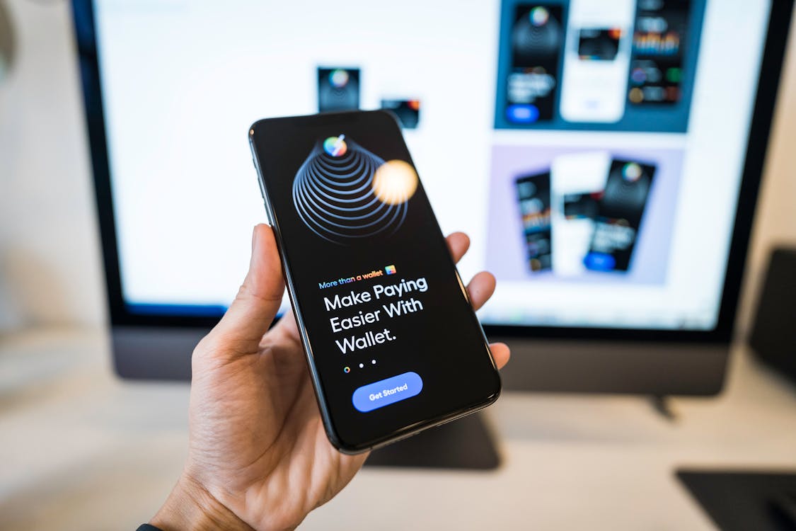
On a desktop, a mouse pointer can hit a link a few pixels wide. On a phone, a thumb covers far more of the screen, and many people browse with one hand. When links sit close together, visitors tap the wrong one, get annoyed and leave. That’s why good mobile UX design starts with tap targets.
The major platforms publish clear minimums. Apple’s design guidelines call for tap targets of at least 44 by 44 points, and Google’s Material Design suggests 48 by 48. The WCAG 2.2 accessibility standard accepts 24 by 24 CSS pixels for most targets, but treat that as a floor, not a goal. For money buttons like Call, Book or Get a Quote, go bigger and leave space around them.
Put Key Buttons Where the Thumb Lands
The middle and bottom of the screen are the easiest spots to reach one-handed. The top corners are the hardest. For that reason, a slim bar pinned to the bottom, with Call on one side and Book on the other, works well for service businesses. For example, an HVAC company in Toms River might keep that bar on every page, so a worried homeowner never scrolls back up for the number. Just keep it thin, and don’t let a chat bubble sit on top of it.
Make Every Phone Number and Address Tappable
A phone number typed as plain text, or baked into an image, forces people to memorize it and switch apps. Instead, wrap every number in a click-to-call link (your web designer will know it as a tel: link). Similarly, link your address to a map so directions open in one tap. Both are small fixes that remove real friction.
Mobile Forms People Actually Finish
Forms are where many phone visitors give up, because typing on glass is slow and fiddly. Every extra field is one more reason to stop. For a first contact, you rarely need more than a name, a phone number or email, and a short “How can we help?” box. Save everything else for the follow-up call.
Fine-Tune the Fields
Then tune the details that make it easy on a phone:
- Trigger the right keyboard. Set phone fields to the “tel” type so a number pad appears, and email fields to “email” so the @ key shows up.
- Turn on autofill. Proper autocomplete settings let the phone fill in a name, email and number with one tap.
- Put labels above fields. Placeholder text vanishes once someone starts typing, which leaves them guessing what the box was for.
- Use at least 16px text inside fields. On iPhones, Safari zooms in when someone taps a field with smaller text, and part of the page slides off screen.
- Show errors next to the field. And keep what the person already typed, because wiping a half-finished form loses leads.
Some industries need extra care. For instance, a dental office in Paramus shouldn’t ask about symptoms or insurance in a basic contact form unless the form vendor supports HIPAA and signs a business associate agreement. Likewise, if you plan to text leads, add a consent checkbox that isn’t pre-checked, since marketing texts generally require express written consent under the federal TCPA.
Text You Can Read Without Pinching
If visitors have to pinch and zoom to read your service page, some of them are already gone. Set body text to at least 16 pixels, give lines roughly one and a half times the font size in spacing, and keep paragraphs short. Also make sure the page fits the screen with no sideways scrolling.
Contrast matters just as much. Light gray text on white looks sleek on a designer’s monitor, but outside in the noon sun it nearly disappears. In fact, the WebAIM Million accessibility study found low-contrast text on 83.9% of the top million home pages in 2026. Run your color pairs through a free contrast checker. WCAG asks for a ratio of at least 4.5 to 1 for normal body text.
Readable text and roomy buttons also help people with low vision or shaky hands, and that matters legally too. The U.S. Department of Justice explains in its guidance on web accessibility and the ADA that businesses open to the public must not shut out people with disabilities, and that includes websites.
Mobile Menu Design That Stays Out of the Way
The three-line hamburger menu is fine on a phone. The trouble starts when everything important hides inside it. Keep your phone number and main call to action outside the menu, and hold the top level to five to seven items. Instead of twelve service pages in the menu, list Services once and let that page sort them.
Remember, too, that phones have no hover. Dropdowns that open on mouse-over either fail on touch or open by accident, so use tap-to-expand sections with a clear arrow. Finally, make the menu easy to close, with a large X that a thumb can reach.
Then there are pop-ups. A full-screen coupon that appears the second someone lands, with a tiny close button, sends people away. Google’s own search guidance also advises against pop-ups that block the main content. If you need one, delay it, keep it small and make it easy to close. Hold cookie banners and chat widgets to the same standard.
Speed and Stability Are Part of Mobile UX
Even careful mobile UX design falls flat if the page loads slowly or jumps around. Google’s Core Web Vitals thresholds put numbers on this. The main content should load within 2.5 seconds, the page should respond to a tap within 200 milliseconds, and layout shift should stay at 0.1 or less.
Layout shift hurts most on phones. Picture someone reaching for your Call button just as a late-loading banner pushes it down, so they tap the wrong thing. Reserving space for images and banners prevents that. As for raw speed, the usual culprits are oversized photos, too many plugins and bargain hosting, which our website speed optimization service handles in depth. For other silent leaks, see why your small business website may be costing you customers.
A 15-Minute Mobile UX Test for Your Website
You probably manage your site from a desktop, so its phone version can drift for months unnoticed. Grab your phone, turn off Wi-Fi so you’re on cellular data, and work through this list:
- Load your home page and count the seconds until you can use it.
- Find your phone number and start a call. It should take one or two taps.
- Fill out your contact form with one thumb. Note every annoying field.
- Read a service page outside in daylight. Can you read it without zooming?
- Open the menu, go three pages deep, then try to get back to the home page.
- Repeat on a different phone, such as an Android if you own an iPhone.
Better still, hand your phone to someone who has never seen the site and watch quietly. Where they hesitate is where your leads leak. Then run the page through Google’s free PageSpeed Insights for a technical second opinion.
Frequently Asked Questions
Is a responsive theme enough for good mobile UX design?
No. A responsive theme makes your layout fit a small screen, and that is only the starting point. It won’t shorten your form, fix washed-out colors or move your Call button within thumb reach. Those choices still take someone looking at the site on a real phone.
How often should I test my site on a phone?
Test after every change to your theme, plugins, forms or menu, and once a quarter otherwise. Plugin updates and new pop-ups tend to break phone layouts quietly.
Get a Second Set of Eyes on Your Site
Most phone-screen problems aren’t hard to fix. They’re just invisible from a desktop chair. Samaroo Solutions is based in northern New Jersey and works with businesses across the state, from Bergen County down to the Shore. Our web design team handles mobile UX design on new builds and on existing sites that need repair.
Thinking beyond the website? Our guide to mobile marketing for New Jersey businesses covers near-me searches, maps and click-to-call ads. And when you’d like a fresh look at your own site, get in touch with our team to talk through what you’re seeing on your phone.